The humble tablet has often been overlooked in favour of laptops and even large smartphones, but it has gradually become a viable business option over the last few years and choosing the best business tablet around has become a challenging task.
Whether on its own or with accessories like a physical keyboard and stylus, the tablet is versatile, portable and full of capabilities. What's more, some of the biggest tech companies around, such as Apple, Samsung and Microsoft, have recently been producing some of the finest tablets we've ever seen, adding more powerful CPUs, greater collaboration features and stunning touchscreen displays.
So much so, that picking the best tablet for your business is no simple task. Here at IT Pro, we've curated the best for 2023 to help you make the right choice.
What to look for
When choosing a business tablet, it’s important to consider what specific roles or functions it’s going to be used for, as this will influence what features you will need to look for and the level of performance you’ll require.
Apple, Samsung and Huawei often use their own first-party silicon to power their devices, but you’ll also find tablets with third-party processors. Qualcomm Snapdragon chips are almost always the most reliable of these, while the MediaTek processors often found in cheaper devices are usually best avoided if you need top performance. For organisations that want a device they can give to front-line workers to host specific business apps, however, these cheaper devices may be a cost-effective solution.
Due to their mobile nature, it’s also worth thinking about the connectivity of your device. Opting for a tablet with support for the latest Wi-Fi 6 or 6E standard will future-proof your device and allow it to make the most of business-grade wireless infrastructure. If you’re offering devices to mobile workers who need access to mobile broadband when out on the road, then it’s advisable to pick a 5G-enabled model over a device that’s limited to 4G for similar reasons.
FAQ
What tablet operating system should I pick?
In the world of pure tablets - as opposed to convertible and hybrid devices - there are only two real choices: Android or iPadOS. As with smartphones, iPadOS devices are highly polished but comparatively expensive, while Android tablets offer greater choice and affordability, but aren’t necessarily as impressive.
That said, outstanding Android-based tablet devices do exist. Indeed, there are several on this list. The question of which OS to go for, then, comes down more to your particular needs than it does to inherent quality. If you’re already invested in one particular ecosystem via other devices, it may be logical to stick within that ecosystem and take advantage of the benefits of a unified platform, but you can also mix things up without losing out.
Google’s focus on productivity and app integrations makes Android a good fit for those who want to use their tablet mainly as a companion device. On balance though, iPadOS is better for those looking to do serious work, thanks to the inclusion of a number of quality-of-life features introduced by Apple over the years, including an app dock, multi-tasking support and USB-C connectivity.
Should I buy a tablet with a keyboard?
These days, the line between convertible laptop and tablet is becoming increasingly blurred. Thanks to the growing sophistication of tablet devices and the prevalence of cloud-based apps, many tablets are viable options for light work tasks, and many now come with optional keyboards to better support this.
If you’re planning to use your tablet for general-purpose computing - including tasks like replying to emails, typing up reports and conducting online research - opting for a keyboard can significantly improve your efficiency. If you’re more focused on using it for handwritten notes, social media management or general organisation, then you may be better off forgoing this option, however.
What size of tablet should I buy?
Tablets tend to come in three main sizes: 8in, 10in and 12in. While examples of other sizes can be found, these are the most common, and between them they cover most use-cases for tablet computing.
Each is best-suited to particular tasks; smaller 8in tablets are ideal for things like social media management, emails and communications, as they’re small enough to be comfortably carried around while still offering a decent amount of screen real estate. 10in devices, meanwhile, are well suited to note-taking and digital art thanks to a balance between working area and portability, while the larger 12in models are most useful for content consumption and document editing - particularly when paired with a keyboard.
You may also want to consider the ergonomics of different sizes; some may find larger tablets to be unwieldy to use on the move, for example, while others might find smaller tablets don’t offer enough space for comfort. Much of this is down to personal preference - although it’s also worth noting that, due to space constraints, larger tablets tend to be more powerful than smaller ones.
Can a tablet replace a laptop?
Tablets have become incredibly advanced over the last several years, and some argue that they’re now capable of replacing traditional laptops. As with most things, however, whether or not you can get away with swapping your notebook for a tablet will depend on how you want to use it.
From a purely technical perspective, tablet devices can match laptops in most areas; performance for high-end tablets is at least as good as what you’d expect from an equivalently-priced PC, and the displays are often better than most laptops. They support touchpad, mouse and keyboard interactions, and they often boast additional features that laptops don’t usually have.
The big sticking point, however, is compatibility. Because they’re limited to running mobile apps, there’s a lot of software that simply won’t run on tablet devices, and even when there’s an app-based equivalent, it’s often a cut-down version. It’s certainly possible to use a tablet for all your day-to-day work computing, but if that’s your goal, you’d be well advised to make sure that everything you want to do can be accomplished via mobile apps first.
Microsoft Surface Pro 8 Pro for Business
Best for Windows 11

The lukewarm reception the Surface Pro 7 and 7+ got from critics may have forced Microsoft to make some substantial changes with the Surface Pro range. Whatever the company did, it certainly was welcome as the Surface Pro 8 for Business is a real improvement. With its bigger screen, Thunderbolt 4 connection and intuitive stylus, the 8 is one of the best Windows tablets around.
Performance-wise the Pro 8 offers a significant boost compared to both the 7 and 7+, and its 5,108 multithreaded scores in GeekBench 5 put it above a number of other Windows and Android-based offerings. For comparison, the Samsung Galaxy Tab S7 only managed 2,814 for multithreaded. Similarly, under our display calibrator tests, the Pro 8 showcased 99% of the sRGB colour space - just 93.5% for the Galaxy Tab S7.
What's more, as a Microsoft flagship the Surface Pro is a perfect tablet to get the full Windows 11 experience (or 10 if you don't upgrade). It's also stocked with Office 365 apps and usually comes with subscription offers.
| Processor | Intel Core i7-1185G7 |
| RAM | 16GB |
| Storage | 226GB SSD |
| Screen size | 13in |
| Screen resolution | 2,880 x 1,920 |
Price when reviewed: £1,316 exc VAT
Read our full Microsoft Surface Pro 8 review for more information.
Apple iPad Pro 12.9in (2021)
Best for creative types

This is probably one of the best tablets available on the market, with many considering the iPad Pro 12.9in to be a fantastic piece of hardware. The device has great battery life for a tablet of this size, it can go toe-to-toe with the MacBook Air and MacBook Pro when it comes to power, and its Mini-LED screen technology makes it stand out from the other tablets in the crowd.
The device can even give normal laptops a run for their money, the only thing holding it back is that it’s unable to make the most of a second display, as well as its hefty price tag. The iPad has a much nicer display and comes with a touchscreen when compared to the Apple MacBook Air, but if you buy the tablet as well as a keyboard it comes out as more expensive than the laptop.
If you’re looking to buy the 12.9in Wi-Fi model with 128GB storage it will set you back £999. There’s an extra £199 on top of this if you buy the Smart Keyboard Folio, although it’s an extra £329 if you opt for the Magic Keyboard instead. The price for the 12.9in iPad Pro now sits at £1,328 for the full laptop alternative experience.
| Processor | Apple M1 (8-core CPU/GPU) |
| RAM | 8GB |
| Storage | 128BG/256GB/512GB/1TB/2TB |
| Screen size | 12.9in |
| Resolution | 2,048 x 2,732 |
Price when reviewed: £1,107 exc VAT
Read our full Apple iPad Pro 12.9in (2021) review for more information.
Lenovo Tab P11 Pro
Best Android tablet
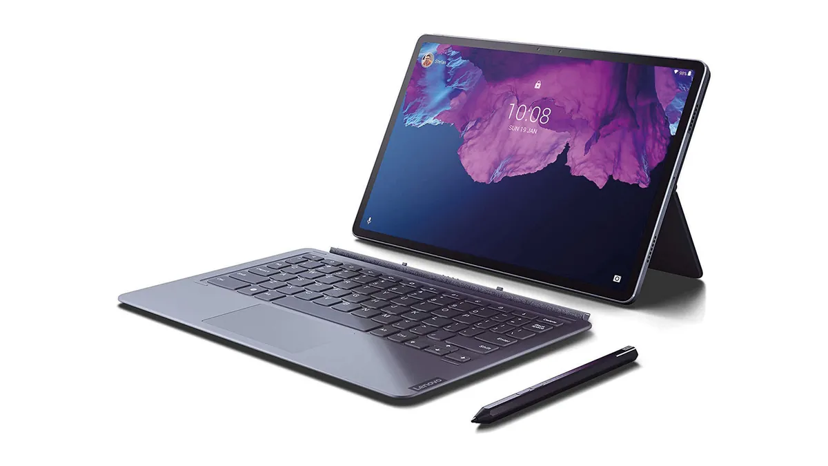
If you’re looking for a device that offers a similar performance to a laptop, then it’s worth taking a look at the Lenovo Tab P11 Pro, which is a versatile and solid Android-based tablet. It comes with a 11.5 in display, with 2,560 x 1,600 resolution and a 120Hz refresh rate. Inside, you’ll find it’s powered by a Snapdragon 730G chip with 6GB RAM. It can do pretty much anything an SMB needs it for, but for a much cheaper price than rivals like the Surface Pro or iPad.

Putting the 'fun' back in a fully functional WFH world
Sample our exclusive Business Briefing content
Unfortunately, the device’s Android operating system does hold it back a little, especially when it comes to apps like Microsoft Office or Google Docs where their apps’ design has been crafted with smaller touch screens in mind. It can be a little too simple for a user using a touchpad and keyboard, and very different to the experience someone would get using a Windows tablet.
Despite this, if you’re comfortable using an Android device, the Tab P11 Pro is a very good business device option. Its display will impress you, earning 99.6% of the sRGB colour space in our tests. This puts it just below the iPad Pro, but slightly higher than the Surface Pro 8 from Microsoft. Additionally, it had a great battery life, scoring 17hrs 6mins in our battery tests, much better than the 13hrs 30 min of the iPad Pro, and cheaper too. However, it let itself down when it came to its GeekBench 5 scores, where it scored 533 for single-core, 1,698 for multi, putting it very far away from both the Surface Pro and iPad Pro.
| Processor | Qualcomm Snapdragon 730G |
| RAM | 6GB |
| Storage | 128GB SSD |
| Screen size | 11.5in |
| Screen resolution | 2,560 x 1,600 |
Price when reviewed: £500 exc VAT
Read our full Lenovo P11 Pro review for more information.
Microsoft Surface Go 3
Best Windows experience on a budget

The Surface Go 3 is Microsoft’s answer to the call for more portable devices, with this piece of hardware being the tech giant’s budget version of its Surface range. Following in the footsteps of the original Surface G and the Surface Go 2, the third iteration aims to contain all the benefits of the Surface Pro range, but with lower specifications.
If you have fewer hardware demands, this could be a good everyday tablet for you, but it’s important to underline that it isn’t a portable workstation. Instead, you get to enjoy Windows 11 on a tablet with a decent screen. The Go 3 achieved nearly the same result as the pricier Pro 8 in our calibrator test, coming in at 98.9% for sRGB colour coverage.
The bad news is that under the hood, the device lacks a bit of power, and it can’t really keep up with any other Surface tablet, or even an Apple device. For multithreaded performance, it achieved a 1,611 in our GeekBench 5 test, which is closer to the Nokia T20 instead of a normal Surface product. If you find yourself needing to use a number of applications at the same time during your working day, and are a big fan of Surface products, it could be a good idea to upgrade to the 8 and pay a little extra.
On the other hand, if you’re only looking for a device to create and present spreadsheets, this will meet your expectations and is also very cheap. Some would say that it comes at such a low price, it shouldn’t be classed as a ‘Surface’ laptop.
| Processor | Intel Pentium Gold 6500Y |
| RAM | 8GB |
| Storage | 64GB SSD |
| Screen size | 10.5in |
| Screen resolution | 1,920 x 1,080 |
Price when reviewed: £391 exc VAT
Read our full Microsoft Surface Go 3 review for more information.
Nokia T20
Best budget tablet

Known for its smartphones and telecommunications functions, you might not know that Nokia also offers tablets. The T20 is a great business tablet for buyers on a budget, even if it isn’t the most glamorous of options.
Unfortunately it doesn’t have a dedicated stylus, and it only achieved a score of 74% in our sRGB colour space tests, meaning that it isn’t the best multimedia device. Its power score was a similar story, getting 1,165 for multithreaded workloads, in GeekBench 5. As you can see from these scores, the device works better for users who have minimal requirements from their tablets. It operates a fluid and neat version of Android, and comes with the normal Google apps and services, meaning that your staff should be more familiar with the device even before using it.
At this price range, you might expect a flimsy plastic body on the device, but you’ll be pleased to know it has a solid aluminium build. It also comes with a two-year update warrant for the operating system. This is a great bonus, since it means your business will enjoy security protection for a while after you initially buy it.
| Processor | Unisoc Tiger T610 |
| RAM | 3GB |
| Storage | 65GB |
| Screen size | 10.4in |
| Screen resolution | 2,000 x 1,200 |
Price when reviewed: £199.99 exc VAT
Read our full Nokia T20 review for more information.
Lenovo Tab P11 Pro (2nd Gen)
Best on-the-go experience

Even though Lenovo is more widely associated with leading the pack in terms of PC sales, this manufacturer also produces tablets. The Lenovo Tab P11 Pro (2nd Gen) is the updated version of the Tab P11 and Tab P11 Pro tablets. This is a reliable tablet that is great for users who are familiar with the Android tablet operating system. It also has a rich, beautiful, screen which makes working from it a pleasure.
Be aware, however, that it probably won’t be enough to replace a laptop, unless you’re more than comfortable working from a tablet , but is definitely a device perfect to be on-the-go. Additionally, its £367 price tag is an absolute steal when you compare it to heavyweights like Microsoft Surface Pro 8 Pro for Business (£1,316 exc VAT) or Apple iPad Pro 12.9in (£1,107 exc VAT).
| Processor | MediaTek Kompanio 1300T octa-core processor |
| RAM | Up to 8GB |
| Storage | 256GB |
| Screen size | 11.2in |
| Screen resolution | 2,560 x 1,536 |
Price when reviewed: £367 exc VAT
Read our full Lenovo Tab P11 Pro (2nd Gen) review for more information.
Dell Latitude 7320 Detachable 13.3in
Best Dell experience

The Dell Latitude 7320 Detachable is a tablet aimed for business users who prefer touch-screen displays. This 13.3in device can be used by itself, or with its detachable keyboard. It’s a competent Windows tablet with good performance, decent battery life, and lightweight.
Office users will be happy to know it lasted for 8hr 35mins in our battery tests, meaning it should get through a full working day without any hiccups, as long as you aren’t too performance intensive. Additionally, it has a 5MP webcam that produces a crisp image, which will be good for any video meetings.
The best thing about the device are its bright and colourful display as well as its solid keyboard dock. Although it won’t win a competition with a laptop, it is extremely light and flexible.
| Processor | Intel Core i5 1140G7 |
| RAM | 16GB |
| Storage | 256GB NVMe SSD |
| Screen size | 13.3in |
| Screen resolution | 1,920 x 1,080 |
Price when reviewed: £1,474 exc VAT
Read our full Dell Latitude 7320 Detachable 13.3in review for more information.
How we test
When it comes to tablets, our testing methodology is almost identical to smartphones. To measure performance, we use the Geekbench 5 app, which measures single- and multi-core speeds. In the event that this isn’t available for a particular tablet, we’ll use an alternative benchmark app, then run that app on another device for which we do have Geekbench results, and use that to gauge relative performance.
We test the display with a colorimeter and the open-source DisplayCal software, measuring the maximum brightness and contrast, as well as what percentage of the sRGB colour gamut the panel can represent. We’ll also test how accurately those colours are reproduced, based on the average Delta-E - which indicates how closely it mirrors the target hue.
In order to test battery life, we used a looped video playback test, setting the screen’s brightness to around 170cd/m2 in order to ensure comparable results and putting the device into flight mode. We’ll then play the video until the battery dies, measuring how long this takes. This allows us to compare different devices, but doesn’t necessarily indicate real-world performance; this is assessed by examining the average battery life over the course of our testing, subjecting it to real-world use across a variety of workloads.